-
Chris Wright, Toe Poke writerSep 25, 2024, 04:00 AM ET
Not all soccer kits are created equal. Some jerseys are so stylish and beautiful as to be universally admired; others, almost by design, will provoke a variety of reactions that are all just as strong.
Rather than play it safe with a simple and classy take on a club’s traditional colours, sometimes it’s more interesting when those in charge of creating football shirts take a big swing and go for broke.
The result may be a new cult classic that creates an unexpected surge in demand from fans around the world, or nightmare destined to appear on worst kit lists for years to come.
Editor’s Picks
1 Related
These are more likely from teams outside the elite, with clubs becoming increasingly aware of the attention a unique and eye-catching kit can earn them outside of their home country. But that’s not to say that you won’t see the odd unorthodox design worn in a top-tier match here or there.
Here we have selected a dozen of the wildest and most surprising kits you will see anywhere in the world during the 2024-25 season. You might love some, you might hate some, but you won’t forget any of them.
Instagram @atletico
The Brazilian club’s third kit presents a stern challenge for the retinas, with multiple gray lightning bolts running down the entire shirt from top to bottom. The monochrome zig-zags are certainly a fresh take on their traditional black-and-white stripes, but stare at it for too long and your vision will begin to blur.
Atlético Ottawa, away (Macron)
Instagram @atletiottawa
This jersey was designed by the Canadian Premier League side as “a symbol for Ottawa’s ever-growing and vibrant soccer culture.” It incorporates the “Radiant ‘O'” symbol of the city’s tourist board and, according to the club, the multicoloured design “reflects our diverse fan base and city.” It’s an admirable ethos, but the result is likely to split opinion between those who find it utterly beautiful and those who think it’s overly busy.
Basel, home (Macron)
Instagram @fcbasel1893
Basel never usually stray too far from their traditional red-and-blue stripes, but 2024-25 has seen the Swiss club attempt something different with their home colours. They appear to have based their flame-licked primary jersey on the wardrobe of Guy Fieri, noted American restaurateur and serving Mayor of Flavortown.
CD Ibiza, third (Kappa)
Instagram @kappa_sport
Melding their red home kit and white away kit to produce something rather incredible as a third kit, CD Ibiza have allowed Kappa to piece together a floral wallpaper design that purportedly taps into the “bohemian spirit” of the Spanish island. It’s actually very stylish, in a retro chic way, while also looking like a flowery blouse your granny might wear to the village summer fete.
Nike
Imagine the results of queasy toddler riding on a roller coaster after one too many cans of grape soda. That would appear to be the artistic direction given to América’s riotous third alternate jersey, although it is actually an abstract mosaic presented in the colour of a deep puce bruise.
Granada, third (Adidas)
Instagram @granadacf
Granada’s new away and third kits both have designs based on the patterns of the traditional azulejo ceramic tiles associated with the region of Andalucia, although you could be forgiven for thinking that they were “Magic Eye” images which reveal a hidden picture if you stare at them for long enough. While the away shirt is at least a soothing white and blue, the third jersey is in a loud green and red colourway. The template has also been adopted by a club in Sweden this season, with IFK Norrköping opting to go with a gaudy green and yellow version.
Instagram @nk_rijeka
Rijeka’s shark fascination began in 2022-23 when the Croatian club launched a shark-themed away kit to help raise awareness of the plight of the fearsome Great White, a species that is often found in the Adriatic Sea. However, they have stepped things up a notch for 2024-25 by unleashing a third shirt that is an homage to the iconic poster for “Jaws,” the movie that did more to turn people against the marine monsters than anything else.
Nongbua Pitchaya, third (Ego Sport)
Facebook @nongbuapitchayatv
Newly promoted to the Thai League 1, Nongbua Pitchaya will grace the top tier in 2024-25 wearing a third shirt that dazzles thanks to its gaudy neon and vibrant blue linear graphic. A large, brooding yellow leopard looms forth from the aurora-like haze thanks to the club’s main sponsor, which just so happens to be one of Thailand’s most popular beer brands.
Instagram @northwichvicsfc
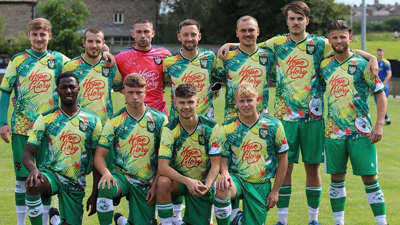
Not many clubs can claim to be wearing kits inspired by cocktails this season, putting Northwich Victoria in a class of their own. Created in conjunction with Northwich songwriter Rupert Holmes, who had a monster hit in the late 1970s with “Escape (The Piña Colada Song),” the English non-league side’s third kit is a tropical scene that features images of pineapples, coconuts and palm leaves. Perfect for getting caught in the rain.
Suwon FC, fourth (Hummel)
Instagram @suwonfc
Designed in collaboration with the local KT Wiz baseball team, the elaborate design of Suwon’s special-edition fourth kit is intended as a celebration of the legendary King Jeongjo of Joseon, who attempted to reform Korea during his 18th-century reign. As if the dragon artwork on the front of the shirt wasn’t ostentatious enough, the back is emblazoned with perhaps the most ornate golden name and number typeface we’ve ever witnessed on a football shirt. There’s a lot going on.
Instagram @tsvhartbergfussball
Whisper it, but we think that Hartberg might just have one sponsor too many on their new kits. A quick count-up suggests the Austrian club have managed to squeeze at least 23 different logos on the shirt and shorts of their home strip, and they even found enough spare real estate to add a few more to the socks as well.
Instagram @usvisf
All three of the Caribbean nation’s kits are festooned with a traditional “Madras” tartan which was created in India, though the Virgin Islands have their own pattern with all the various colours reflecting individual elements of life on the Caribbean archipelago. The black home and yellow third kits stand out well enough, but the swirly patterned backdrop of the light blue away shirt manages to ramp up the visual bombardment to a whole other level.
Vis Pesaro 1898, third (Macron)
Instagram @vispesaro1898
Judging by the anguished looks on their faces, it would appear that the Pesaro players are understandably aggrieved at having to wear the Serie C side’s absolutely atrocious new third kit. The template has an ugly graffiti graphic all over the torso that is chock full of vague scribbles, the type of which can normally be found daubed all over abandoned train carriages that have been left to rot on the outskirts of major railway stations.


